A quality organic French cordial
More than just the realization of a total design, it is the association between two new players from the different but complementary fields of cordials and spirits. No surprise then that his collaboration would lead to a rich creation and the birth of a product deliberately designed as a precious object, both visually and conceptually.
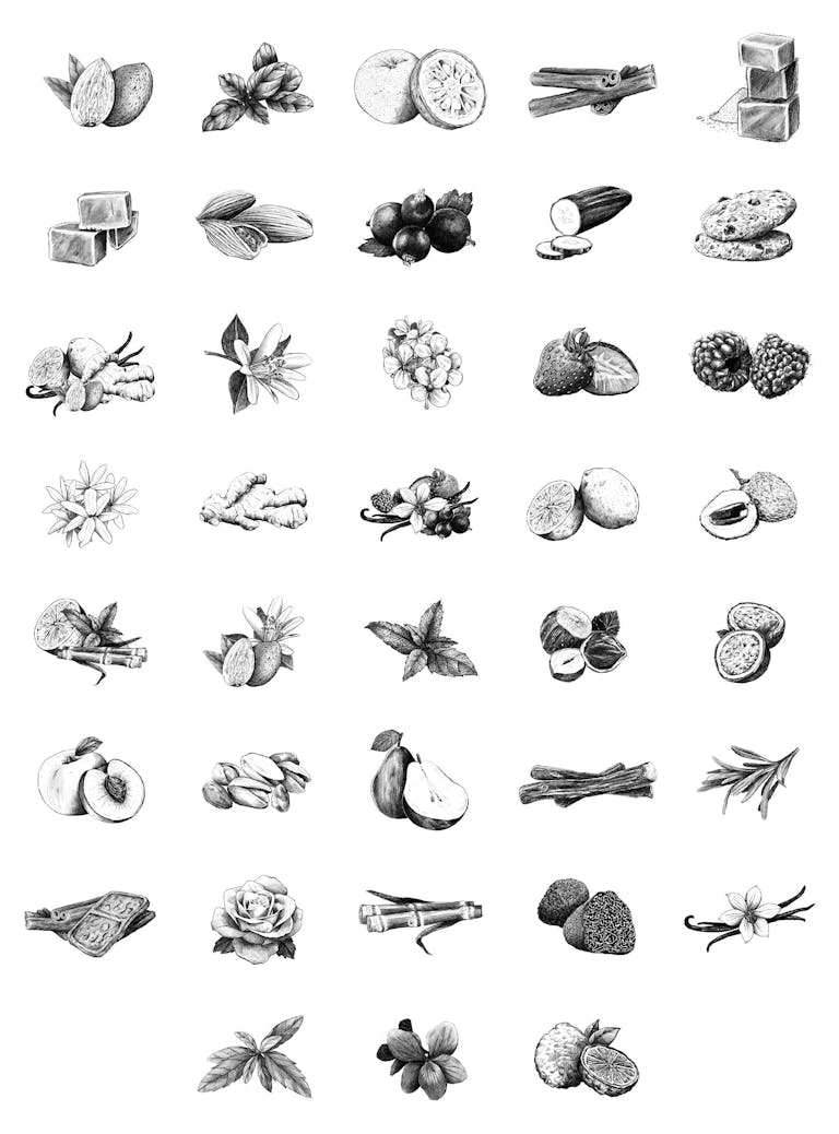
Bacanha, an up-and-coming young company in the field of organic cordials, has entrusted our design studio with the creation and artistic direction of their new bottles. The Bacanha team produces and blends over32 flavors of artisanal cordial.While wishing to promote a brand image that is both fresh and recent, it retains the roots of a traditional mode of production.
This observation led us to create a 360-designbased around a label and a bold bottle design thanks to a clear creative line and throughcombining the twoartistic crafts of drawing and printing.
These two levels of reading with distinct graphic codes cohabit and provide additional information. Through their distinctive execution, these elegant, monochrome graphic signifiers provide clear signposting to the consumer and differentiate the product from competitors sharing the retail space.
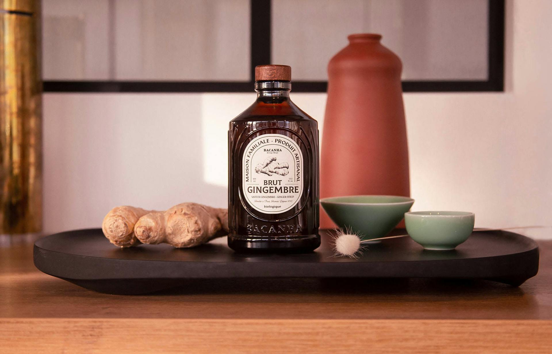
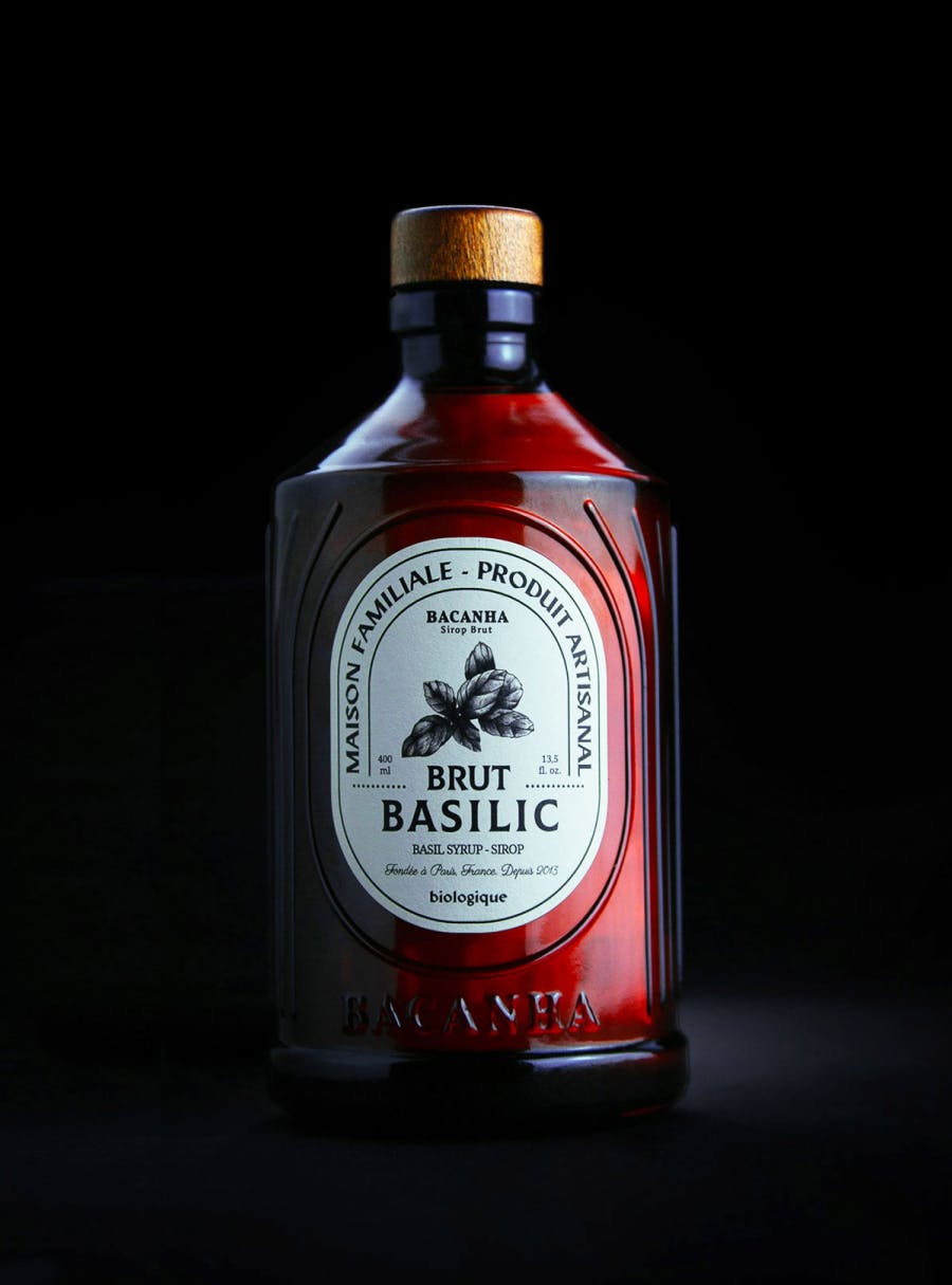
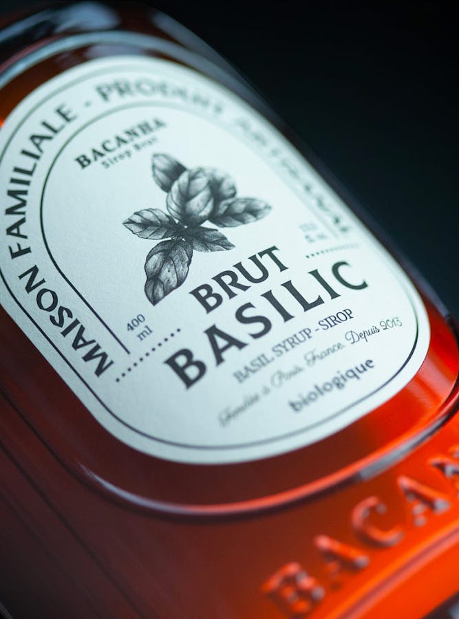
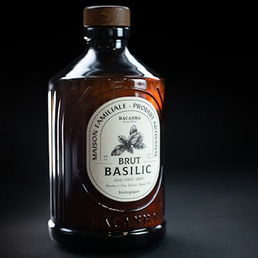
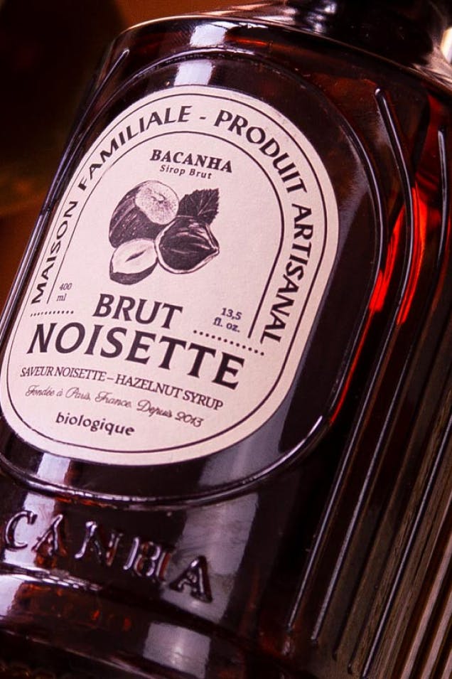
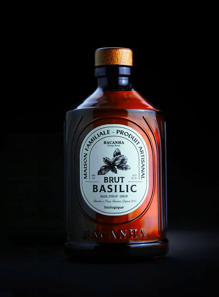
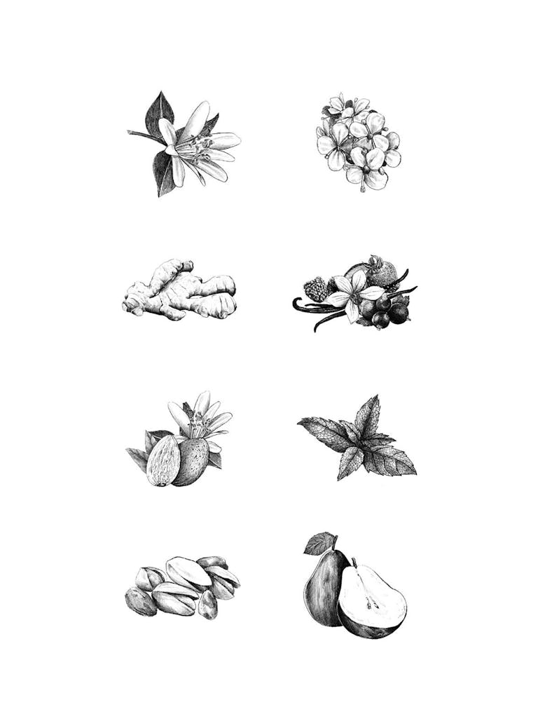
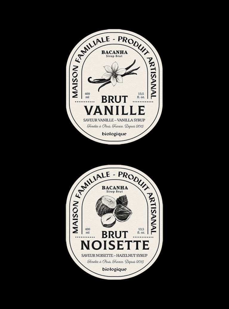
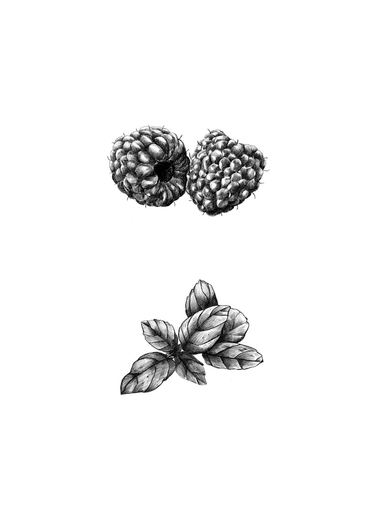
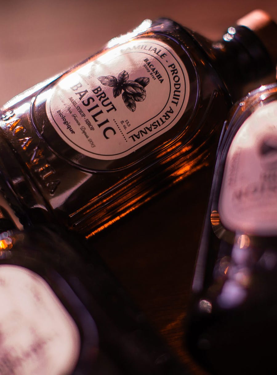
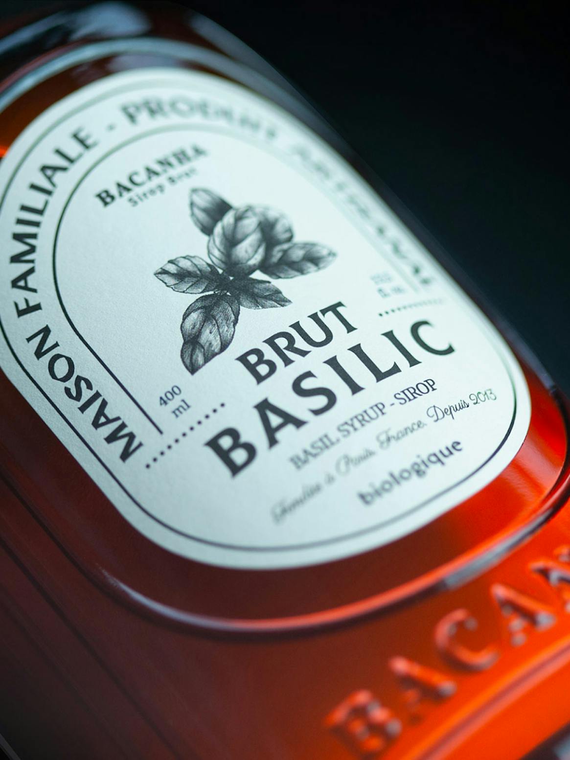
The facing label is subdivided into two compartments, similar to traditional medicines. An illustrative central element highlights the sketch of a fruit or the visual representation of the aroma of the cordial. This is part of the fine and detailed graphic work.
The second part takes the ovoid shape of the label and supports the brand’s proposition by repeating the aroma typographically and supplying the legally required information. Different type weights are used in the prioritization of information. This ordered set of reading levels takes on additional importance with this label which must contain a large amount of information in a small space.

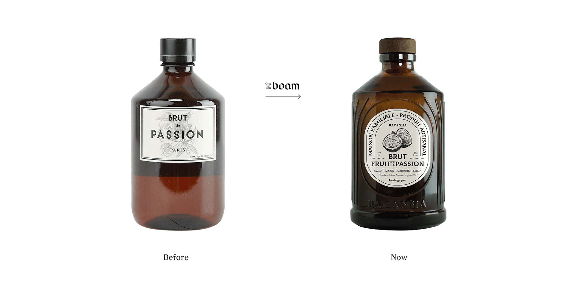
Cette bouteille moulée en verre reprend les grands préceptes graphiques et visuels souhaités par le studio : simple d’aspect, soigneusement dessinée dans les détails, maîtrisée dans sa production et correspondant parfaitement aux étagères d’épicerie fine et commerce de bouche. La base de la bouteille, volontairement surdimensionnée, a une double nécessité : donner une assise lourde et statuaire, puis éviter les frottements des bouteilles sur des zones sensibles et trop visibles.
The body of the bottle, marked by long streaks similar to waves that center on the label itself, position the aesthetic project at the heart of its attractiveness. The carefully crafted form of this 3D graphic is distinctive whilst avoiding destabilizing the general aesthetic of the bottle’s line.
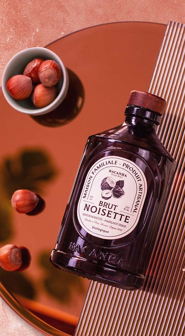
These streaks also help prevent drops of cordial from running over the label. The signature of the brand embedded onto the glass helps further with product differentiation and in anchoring it definitively within the domain of the tailor-made and the distinctive, for new and future consumers of the brand. Customer experience is also distinct and clear, leading to an ideal purchasing journey for a receptive consumer audience.
This subject of this unique total design process was deeply connected with graphics and industrial design that are deeply rooted in Bacanha cordials, and serves as a truly enriching case study. This observation is of fundamental importance to the philosophy of Studio Boam, which believes more and more in this methodology as the gold standard in the management of projects and those brands entrusted to it.