From osmosis to symbiosis
Symbiosis refers to a biological, lasting, and mutually beneficial relationship between two living organisms. Bulles de Ruche is in perfect symbiosis with the nature that surrounds it.
With a mastered production method, a constant pursuit of quality and perfection, and a deep connection with nature, it ensures the transmission of knowledge to its consumers while achieving a harmonious aromatic balance in its products.
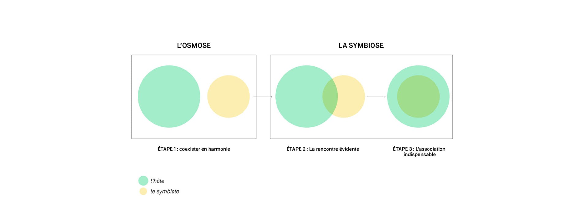
Symbiosis: in pursuit of osmosis
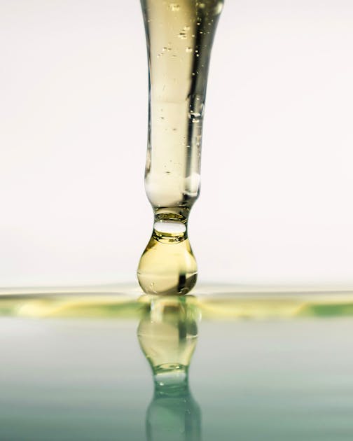
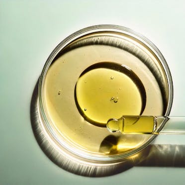
Through this concept, Bulles de Ruche highlights its quest for perfection, driven by long-term R&D efforts led by talented scientists and botanists.
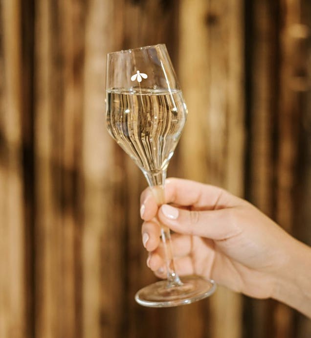
Using a meticulous process of molecular innovation, the Bulles de Ruche team comes close to achieving ultimate osmosis. With a more educational approach, the Bulles de Ruche range features a modern design, incorporating innovative materials and colors.
Objectives of the new identity
To become an iconic and essential brand, establish a premium and trendy image, energize the mead category, and highlight its 100% French origins.
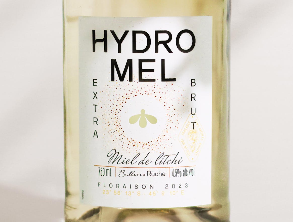
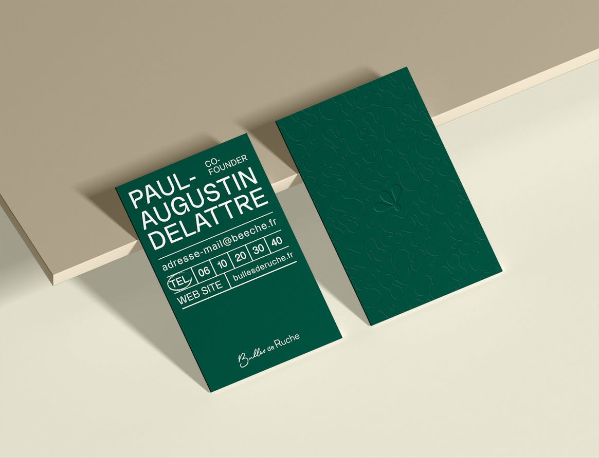
The Bulles de Ruche logo embodies the concept of symbiosis through its hybrid design: the handwritten typography represents a botanist’s or scientist’s signature, while the structured, straight typography reflects a rational and methodical approach.

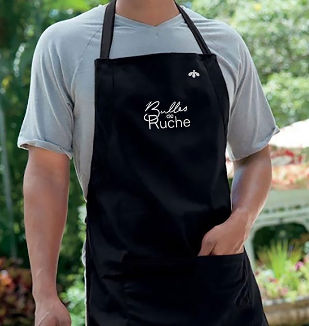
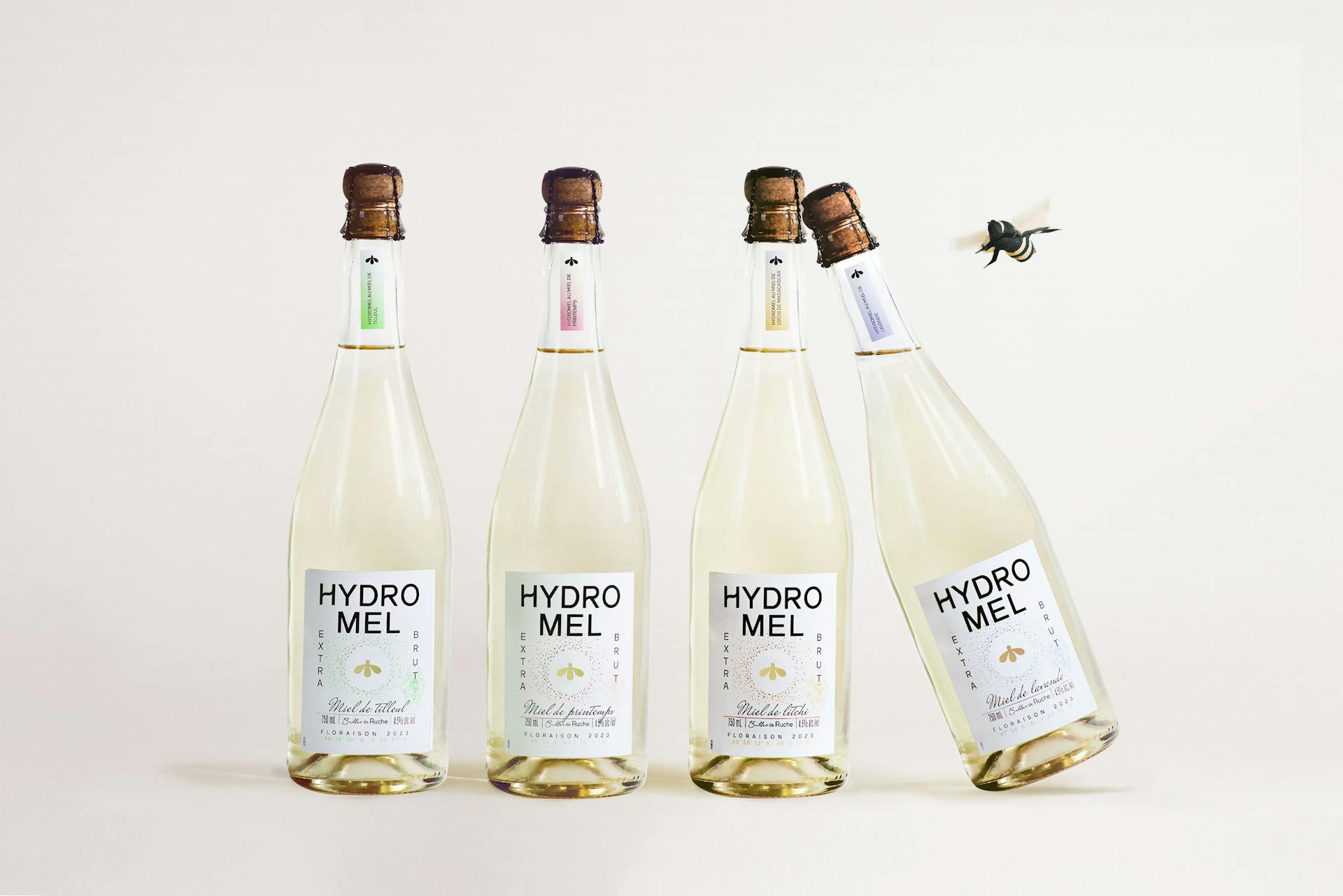
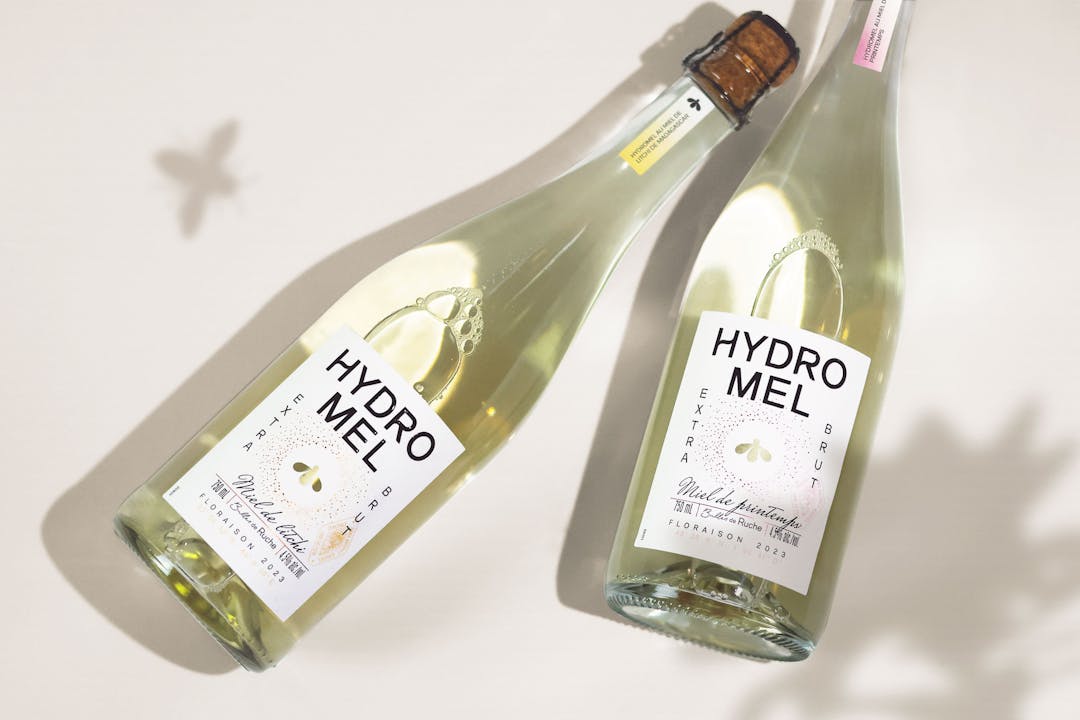
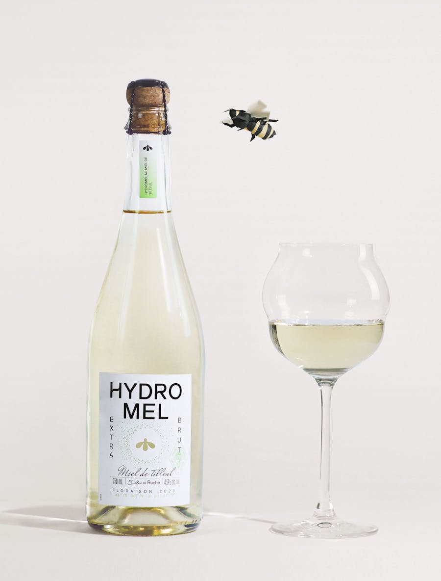
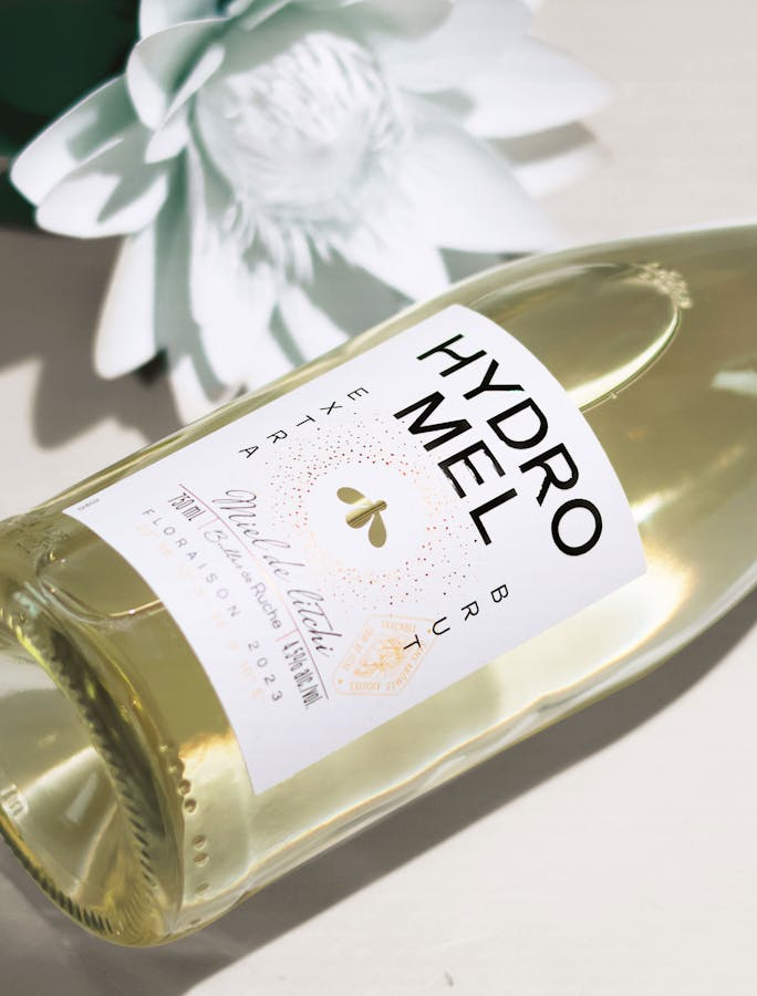
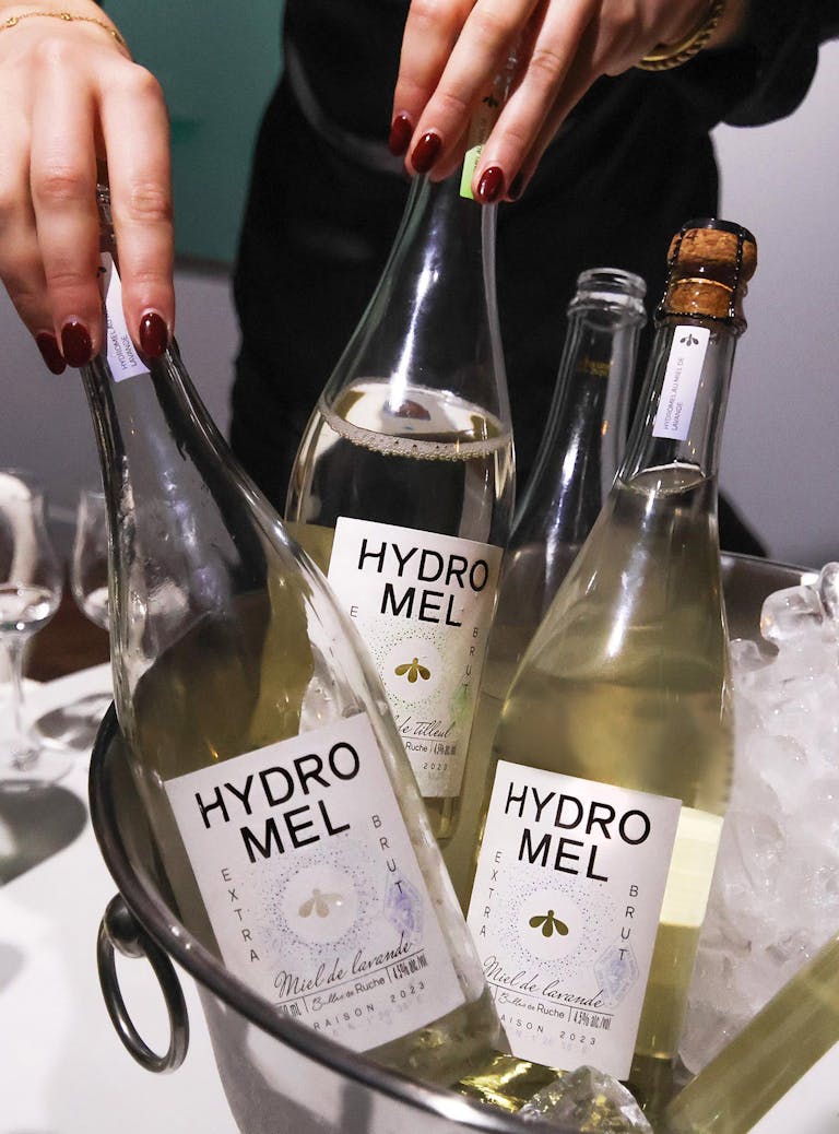
The overall composition of Bulles de Ruche mead is refined and modern. The brand block is impactful and elegant, with clear and precise information. Various graphic elements evoke the presence of honey as well as the fresh and effervescent character of the product.
![]()
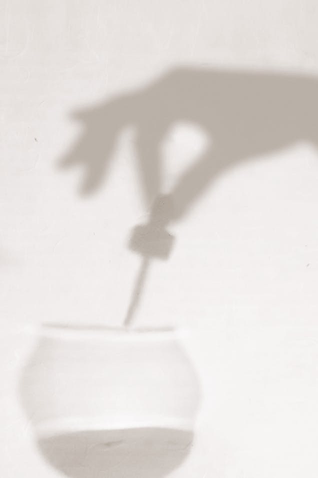
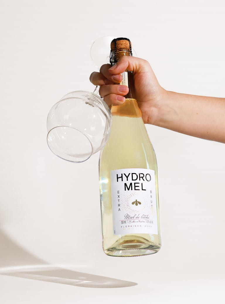
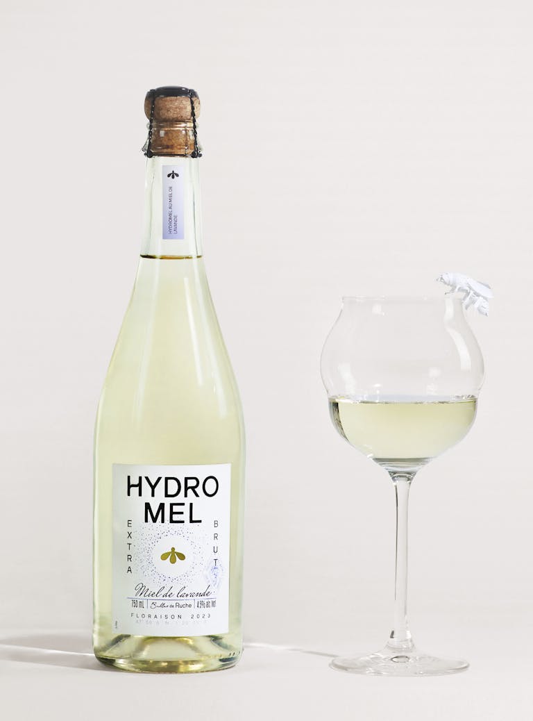
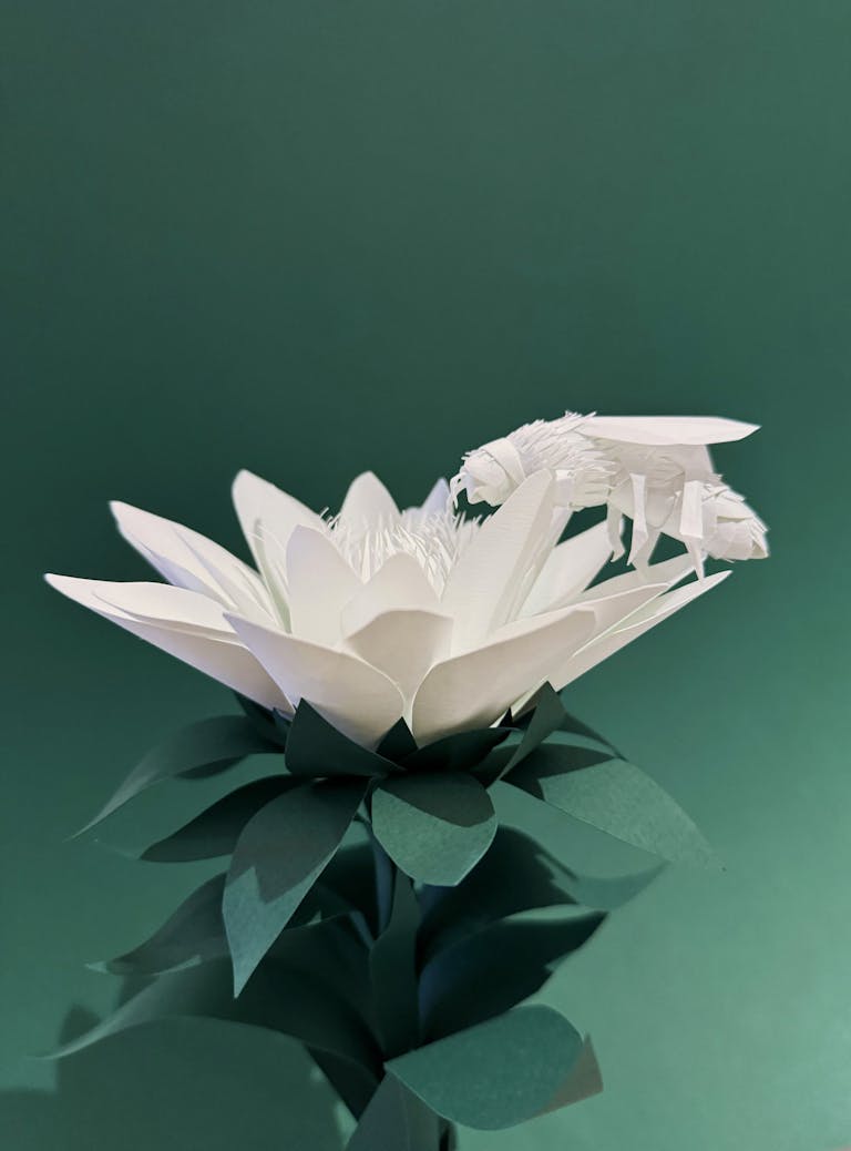
The final step of the symbiosis is illustrated by the cutout of the symbol (the bee) and the circle within the label.